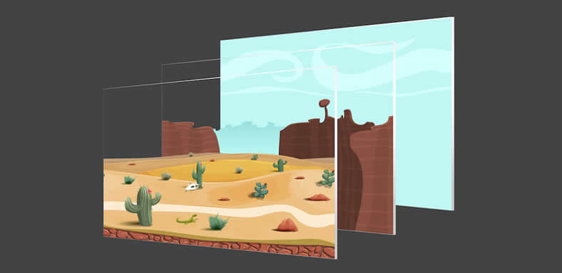
Parallax or Paralysis?

A current trend on the web is to use parallax scrolling instead of the traditional browser scrolling method. Parallax scrolling is a great technique used to tell a story by revealing elements and animations as the user scrolls down. And, when it comes to telling a story, I’m a huge fan of this technique. Here are a few great examples:
Is Parallax The Right Solution For Your Website?
You’d think this was the hottest thing in website development at the moment. But, the fact is, real world applications for parallax scrolling are very rare. In fact, I almost always recommend against this approach for my clients for the following reasons:
- No Real SEO Value – Search engines like Google want content to be delivered fast with usability at the forefront. This single page approach makes people work to consume the content on the page. And, the added time on the page doesn’t add value to SEO if the user simply leaves the page without taking further action
- Responsive/Mobile Issues – Parallax web pages are practically non-responsive. This means they don’t behave well on mobile or smaller devices. And, that’s a huge issue!
- Slow Page Load Times – These pages are typically very resource heavy with large images and code that takes longer to load. The last time I checked, everyone hates waiting for a page to load.
Parallax Makes You Work To Consume Content
Parallax web pages are definitely engaging and visually interesting. And, there are a few situations where they make sense. But, I can’t help but think the real world client who wants to be able to provide the best way for their viewers to access content would be making a mistake taking this approach.
Talk to us before you decide to create a parallax page on your website. We will help you decide if it’s the right solution for you, but in many cases, there are alternative solutions that are far more website friendly while still achieving the same kinds of story-telling results.


