Google Mobile Usability Issues – What Now?
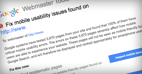
You may have recently received a message from Google via Webmaster Tools regarding mobile usability issues on your site. If that’s the case, rest assured, you’re not alone. Unfortunately for many website owners, it’s likely their websites were built a while back. And, that means their sites are likely not responsive. This year, I’ve seen an unprecedented amount of projects come my way that require migration to a responsive codebase.
What’s a responsive site?
Well, simply put, a responsive site adjusts/responds to the browser dimensions of the site visitor. Using multiple methods, the code is altered to detect the browser width/height and respond accordingly. The point is to create scenarios where the site behaves well on all devices as intended. And, hence, the site is usable on mobile devices.
What does Google want me to do?
Google is focused on one primary objective: Usability on the web. However, in 2014, a Morgan Stanley report showed that 52% of time spent on digital media was done via mobile devices. That means mobile web usage has officially overtaken desktop web browsing. So, Google wants you and I to make our websites work on mobile devices.
How do I do this?
Well, if you have a WordPress website, you have a few options:
- Use a responsive theme from Woo Themes or another resource
- Have your web developer customize your theme to make it responsive
- Have your developer build a new, responsive website
Don’t have a WordPress website?
- If you’re on a Drupal or Joomla! website, responsive themes are available
- If your website is not on a CMS platform, contact your website developer
Can you help me?
Absolutely! If you’re not sure what to do next, the chances are, you need a developer to help get you on track. For questions about responsive sites or any other website issues you’re dealing with, contact me here.
Categories

READY FOR THE CHALLENGE
Bring us your web challenge.
We’re not afraid.
We are the website development partner agencies trust. Shouldn’t you?